The neuroscience of why certain visuals stop you mid-scroll, and what it means for your brand in a market moving as fast as Tampa Bay.
There is a moment that lasts less than half a second where your brand either earns someone’s attention or vanishes into the noise. Not their conscious attention. Their pre-conscious attention. The part of the brain that decides what matters before the rational mind ever gets involved.
Most businesses in Tampa Bay are building brands for the rational mind. Cleaner websites. Better copy. Smarter taglines. And those things matter. But if the visual does not reach someone at the biological level first, none of it gets read. The door never opens.
This is not speculation. There is a growing body of published neuroscience and consumer psychology research that tells us, with remarkable precision, what the human brain prioritizes visually and why. And once you understand the mechanism, you start to see branding and rebranding very differently.
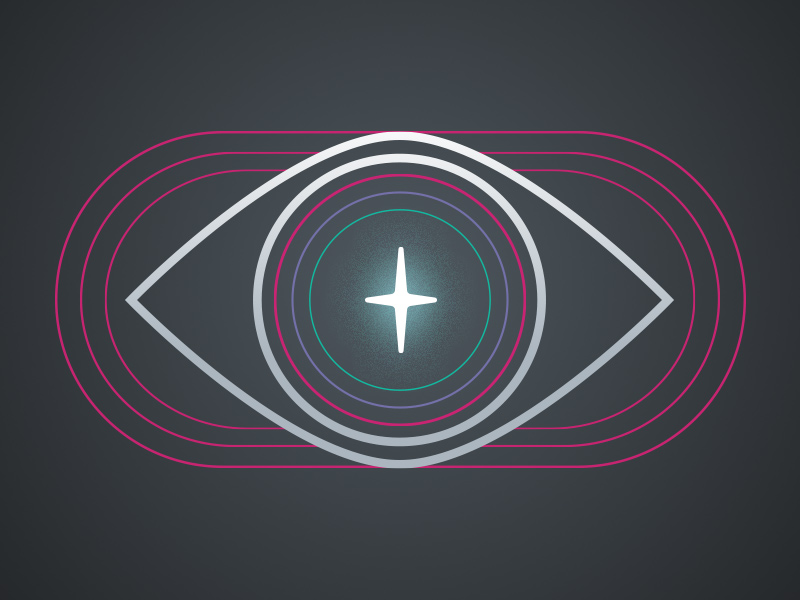
The 500-Millisecond Window
Pre-attentive processing is the scientific name for what happens in the first 50 to 500 milliseconds after your eyes land on something. This phase is automatic, unconscious, and runs in parallel across your entire visual field simultaneously. No conscious effort. No decision-making. Just the brain sorting signal from static at extraordinary speed.
Pre-attentive processing was first formally described through Anne Treisman’s Feature Integration Theory (1980), which establishes that visual perception occurs in two sequential stages: a pre-attentive phase that registers individual features independently, and a subsequent attentive phase that binds those features into unified object representations. The visual cortex processes color, contrast, orientation, and motion in parallel before you are aware of what you are looking at.
Research published in Frontiers in Systems Neuroscience identifies the primary drivers flagged in this window: luminance contrast, color, motion, orientation, size, and spatial frequency. These are not aesthetic opinions. They are the literal architecture of how early visual regions in the brain process incoming data. The primary visual cortex handles them first, before any meaning is assigned.
The implication for your brand is direct: before a potential client in Ybor City or St. Pete reads your value proposition, their visual cortex has already made a judgment call. The only question is whether you designed for that moment or left it to chance.
Attention is not given. It is taken by the visual stimuli that win the biological lottery in that first half-second. The brand that understands this holds an asymmetric advantage over every competitor still designing for the conscious mind.
What the Brain Is Actually Looking For
Salience theory, the scientific framework behind what makes something visually noticeable, identifies specific characteristics that drive bottom-up attention. Research published in the European Journal of Marketing describes these as size, color, brightness, contrast, and motion. They are stimulus-driven, not goal-driven. They fire before intention.
Contrast is king.
Functional MRI studies demonstrate that high-contrast visual stimuli activate the visual cortex more intensely than low-contrast designs. Research from Frontiers in Systems Neuroscience confirms that luminance contrast, color, and orientation are among the primary features coded in early visual regions and guide this automatic, pre-conscious attentional pull. That activation does not guarantee preference, but it dramatically increases the probability of attention. For brands, this is not a subtle distinction. It is the difference between being noticed and being invisible.
Color is the fastest channel.
Research is unambiguous: color reaches us before meaning does. A study published in the Journal of Marketing and Social Research involving 285 participants found that color influences brand recognition by up to 80%. A separate University of Loyola study corroborates this figure. Furthermore, research published in Management Decision found that color accounted for up to 60% of acceptance or rejection of a product, and broader consumer research establishes that up to 90% of snap judgments about products can be based on color alone.
Faces are wired in.
Research on pre-attentive emotional face processing reveals that gaze preferences for human faces are evident very early after stimulus onset, reflecting a pre-attentive mechanism that automatically detects facial features in the visual field. The amygdala plays a central role here, responding to emotional faces in as little as 40 to 80 milliseconds. For branding, this is why photography and human imagery remain the most powerful visual anchors a brand can deploy. It is not a stylistic preference. It is biology.
Motion is impossible to ignore.
Research establishes that a salient item that is moving can capture attention regardless of whether it is task-relevant. Motion activates both the pre-attentive salience system and deeper goal-driven processing pathways simultaneously. This explains why video branding, animated logos, and dynamic digital environments create disproportionate engagement. The brain was built to track moving things, an evolutionary inheritance from a time when movement in your peripheral vision meant something worth noticing.
From Neuroscience to Brand Identity
Here is where the science meets the work. A brand is not a logo. A brand is a pattern of expectation that lives in someone’s mind. It is built through repeated exposure, and those exposures are, at their root, visual. Every touchpoint is either reinforcing or eroding the pattern.
The concept of color-brand personality congruence, documented in research by Labrecque and Milne (2012), found that alignment between brand personality and color associations strengthens consumer preference and loyalty. Coca-Cola’s red reinforces its energetic, bold personality. IBM’s blue supports its perception as trustworthy and measured. These are not coincidences. They are the result of understanding how the visual system assigns meaning, then building consistency around that.
Research published in the Asian Journal of Multidisciplinary Research (2025) confirms what practitioners have long observed: color in branding not only affects visual appeal, it forms a deep emotional impression on consumers that compounds over time. Blue reflects professionalism and trust. Red carries energy and urgency. Green signals growth and health.
But here is the nuance most brands miss. Color-emotion associations are moderated by context, demographic, and category. What resonates with the creative firms clustering in the Channel District may land differently for the healthcare-adjacent businesses in Wesley Chapel. The science gives you the framework. The strategy gives you the application.
Your brand’s visual identity is not your aesthetic preference. It is a communication system, and like all communication, it either transmits clearly or it creates noise. There is no neutral.
What Rebranding Actually Does to the Brain
Tampa Bay is one of the fastest-growing metro markets in the country. Applications to Embarc Collective jumped 40% in 2025 compared to 2024, and over the past five years, local companies have raised over $600 million in equity funding. This is a market in motion, which means brands built for a previous version of a business are increasingly misaligned with the market they are now trying to reach.
Rebranding is frequently misunderstood as a surface-level act: a new logo, refreshed colors, an updated website. The research paints a more dimensional picture. A 2025 study on rebranding and consumer perception establishes that rebranding is most effective when it enhances visibility and emotional engagement rather than attempting to alter deep consumer trust. The visual changes signal evolution. The underlying brand values maintain continuity.
A USF-published case study on Burger King’s rebranding, using the Aaker Brand Equity Model as its theoretical framework, found that consumers bond with brands through visual identity and associational appeal. The research showed rebranding works best when new visual identity attends to existing consumer expectations rather than overriding them. Campaigns that were too radical risked alienating loyal customers who had formed strong emotional connections with the previous visual identity.
Here is the underlying mechanism: brand memory is encoded visually. Logos, color palettes, and typographic systems create anchors in long-term memory. Research confirms that brand memory is influenced by colors, packaging, and logos in ways that are deeply associative. Ferrari’s red and McDonald’s golden arches are not just design choices. They are neural pathways worn smooth by repetition. When you rebrand, you are asking those pathways to reroute.
Done well, rebranding triggers a powerful psychological response: novelty processing. Research on rebranding published in the Journal of Informatics Education and Research found that following a rebranding campaign, innovation ratings among consumers jumped from 2.9 to 4.2, and trust ratings improved from 3.6 to 4.0. The rebranding created genuine perceptual shifts not by destroying the old brand, but by signaling intentional evolution.
When to rebrand and when not to.
This is the question businesses in Tampa Bay are sitting with right now. The market has shifted. Competition has intensified. New audiences have emerged. The brand built when you were a two-person operation no longer reflects the business you are running today.
The research is consistent on the conditions that warrant rebranding: strategic repositioning, a new target audience, significant category shift, or a visual identity that has fallen into incongruence with the business’s actual personality and promise.
The research is equally consistent on what to protect: the brand’s emotional core. The visual language can evolve. The psychological contract with your audience, what they trust you to be, must be honored even as it is elevated.
The Tampa Bay Context
There is something worth naming about doing this work here, now, in this market. Tampa Bay is no longer a secondary market looking to the coasts for permission to matter. Ybor City has become a creative hub. The Channel District and Water Street are reshaping what urban commerce looks like in Florida. St. Pete’s arts ecosystem has made it one of the most visually sophisticated markets in the Southeast. Sarasota’s creative class is growing. Pinellas and Hillsborough are adding tens of thousands of new residents, new consumers, new clients, new expectations.
In a market this dynamic, the visual bar for what earns attention is rising fast. The brands competing for the next wave of Tampa Bay growth cannot afford visual identities built for a previous version of this city. The research backs this: brand recognition built on color, contrast, and emotional congruence is not a luxury for established brands. It is a competitive mechanism available to any business willing to build intentionally.
The businesses winning in this market right now are not necessarily the ones with the biggest budgets. They are the ones whose brand communicates with clarity, consistency, and the kind of visual authority that earns trust in under 500 milliseconds. That window is available to every business in this market. Most just have not designed for it yet.
The most expensive mistake a business makes is underinvesting in the first thing a potential client sees. Because in that half-second, the conversation either begins, or it ends before it starts.
Where the Work Begins
Understanding the neuroscience of visual attention is not an academic exercise. It is a strategic one. Every visual decision your brand makes, from color palette and typography to layout hierarchy, imagery selection, and logo form, is either aligned with how the human brain processes visual information or it is working against it.
The brands that earn disproportionate attention in any market share a few things in common. They have visual contrast that registers before conscious thought. They use color with intention and consistency. They deploy imagery that triggers the brain’s deeply wired response to faces and emotion. And they maintain enough consistency across touchpoints that the pattern in the consumer’s mind becomes clear, reinforced, and ultimately trusted.
Rebranding, at its most powerful, is the act of aligning all of that. Not cosmetically, but strategically. It is the point where a business decides to show up in the market the way it actually operates, the way it genuinely serves its clients, the way it wants to be remembered. That decision is always visual first, because the brain makes that decision first.
There is a half-second between your brand and someone’s attention. Everything we do at Casker Creative is built to win it.
Ready to think about your brand differently? Let’s talk.
Sources
- Treisman, A. (1980). Feature Integration Theory. Cognitive Psychology.
- Frontiers in Systems Neuroscience: Early Visual Processing of Feature Saliency Tasks
- European Journal of Marketing (2022): Influence of Dynamic Content on Visual Attention During Video Advertisements
- Journal of Marketing and Social Research (2025): The Psychology of Color in Marketing
- Labrecque, L.I. and Milne, G.R. (2012). Exciting Red and Competent Blue. Journal of the Academy of Marketing Science.
- Asian Journal of Multidisciplinary Research (2025): Color Psychology in Business Branding
- USF Digital Commons (2024): The Impact of Visual Brand Identity on Consumer Response in Rebranding
- ResearchGate (2025): The Impact of Rebranding on Consumer Perception and Loyalty
- Journal of Informatics Education and Research: Rebranding and Its Effects on Consumer Perception
- Help Scout: Color Psychology in Marketing
- Tampa Bay Small Business Market Outlook 2025-2026